
Mobile Device Usage Rate on E-Commerce Sites
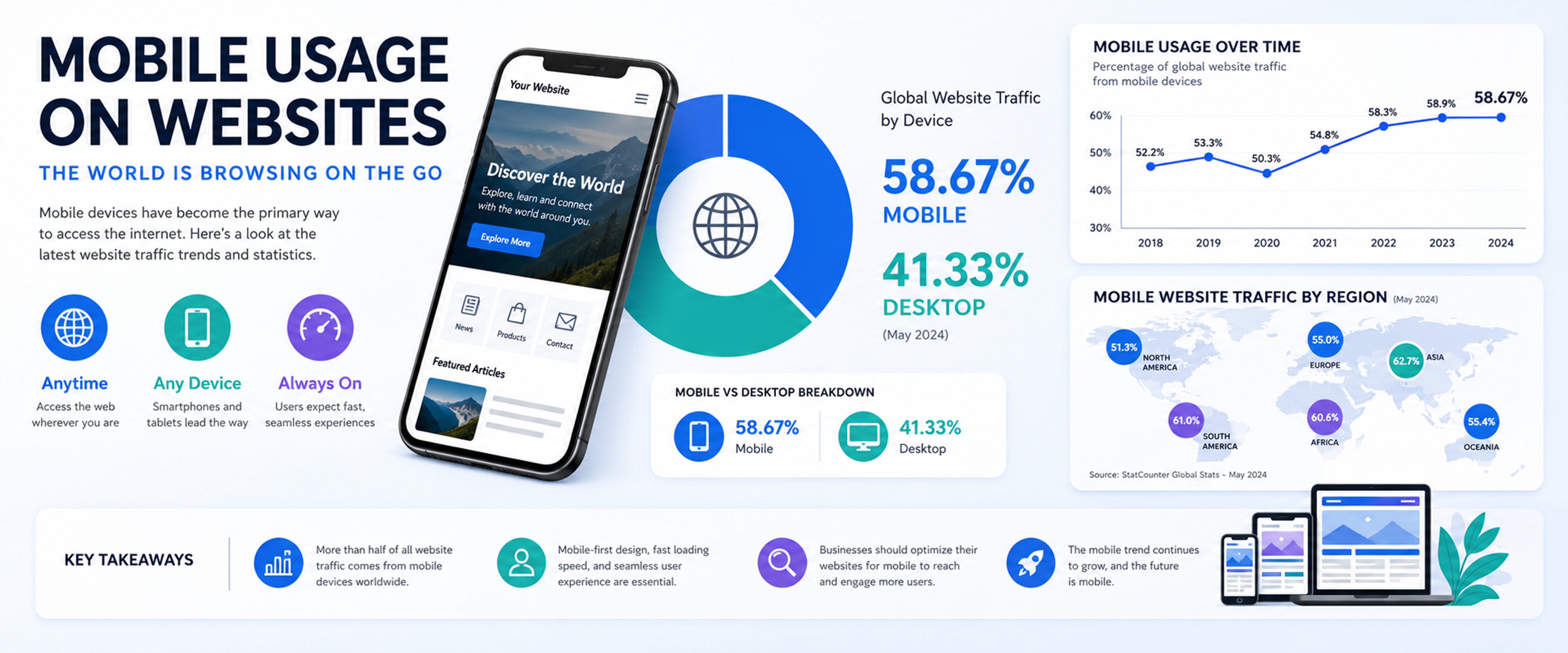
Mobile Device Usage on Websites Worldwide: The Rise of the Mobile Internet
Meta Title: Mobile Device Usage on Websites Worldwide | Mobile Internet Statistics
Meta Description: Discover how mobile devices have transformed global website usage, why mobile traffic continues to grow, and why mobile-first website design is essential for businesses.
Focus Keywords: mobile device usage, mobile website traffic, mobile internet usage, mobile-first design, global website traffic, smartphone internet usage, mobile e-commerce
Introduction
The internet has changed dramatically over the past two decades. What was once primarily accessed through desktop computers is now increasingly accessed through smartphones and other mobile devices.
Today, people can search for information, shop online, read the news, communicate with businesses, watch videos, make payments, and use digital services from almost anywhere. The smartphone has become one of the most important gateways to the internet.
Recent global statistics demonstrate just how significant this transformation has become. StatCounter reported that mobile devices accounted for 53.37% of global website traffic in July 2026, compared with 46.63% for desktop devices. When smartphones are measured separately and tablets are excluded, smartphones represented 51.48% of global website traffic in the second quarter of 2026.
Although the exact percentage changes from month to month, the overall trend is clear: mobile devices have become a dominant channel for accessing websites worldwide.
How Did Mobile Internet Usage Become So Important?
The early internet was dominated by desktop computers. Users generally needed a fixed computer and an internet connection to browse websites.
Mobile internet usage was extremely small compared with desktop traffic.
In 2009, mobile devices represented less than 1% of global website traffic. However, the rapid development of smartphones, mobile networks, and affordable mobile data changed the situation dramatically.
As smartphones became more powerful and accessible, consumers began using them for activities that had traditionally required a desktop computer.
The transition accelerated throughout the 2010s.
One of the most important milestones occurred in December 2016, when mobile devices surpassed desktop computers in global web traffic.
This marked a major turning point in the history of the internet.
The web was no longer primarily a desktop environment.
It had become a mobile environment.
Mobile Devices Now Account for More Than Half of Global Web Traffic
Mobile traffic has continued to represent a very significant portion of global website visits.
According to StatCounter, mobile devices accounted for 53.37% of worldwide website traffic in July 2026, while desktop devices accounted for 46.63%.
This does not mean that every website receives more mobile visitors than desktop visitors.
Instead, it represents a global average.
Individual websites can have very different traffic distributions depending on their industry, target audience, geographical market, and type of content.
For example, an online fashion marketplace may receive a very high percentage of mobile visitors, while a business-to-business software platform may have a considerably larger desktop audience.
This is why businesses should examine their own website analytics in addition to global statistics.
Why Do People Prefer Mobile Devices?
There are several reasons behind the growth of mobile internet usage.
Smartphones Are Always Available
A desktop computer is usually located in a specific place.
A smartphone, however, travels with its owner.
People can access the internet while commuting, shopping, traveling, waiting in line, sitting in a café, or relaxing at home.
This convenience has fundamentally changed online behavior.
Smartphones Are More Powerful
Modern smartphones are essentially small computers.
They can perform tasks that once required expensive desktop hardware.
Users can browse websites, make purchases, manage bank accounts, communicate with businesses, use cloud services, watch videos, and access sophisticated applications from a single device.
Mobile Networks Are Faster
The development of 4G and 5G networks has significantly improved the mobile browsing experience.
Web pages can load faster, videos can stream at higher quality, and increasingly sophisticated online services can be used from mobile devices.
Mobile Internet Is Often the First Internet Experience
In many developing and emerging markets, users have adopted smartphones without first becoming regular desktop computer users.
This has created a mobile-first internet population.
For many people, the smartphone is not simply an alternative way to access the internet.
It is their primary way of accessing the internet.
Mobile Internet and the Global Digital Economy
The growth of mobile internet has had a major impact on the digital economy.
Businesses can now reach customers at virtually any moment.
A customer can discover a product on social media, search for information, compare prices, visit an online marketplace, complete a purchase, and track an order—all from a smartphone.
This has created a new type of consumer behavior.
The customer is no longer required to sit in front of a computer to make a purchase.
The shopping experience can happen anywhere.
This is particularly important for e-commerce and online marketplaces.
Mobile Devices Are Transforming E-Commerce
Mobile technology has fundamentally changed online shopping.
A typical customer journey might look like this:
Social Media → Mobile Search → Product Page → Shopping Cart → Mobile Payment → Order Tracking
The entire process can take place on a smartphone.
This makes mobile optimization especially important for e-commerce companies.
If a customer arrives at an online store from a smartphone and encounters a slow website, difficult navigation, tiny buttons, complicated forms, or a confusing checkout process, the customer may simply leave.
A competitor is often only one search away.
What Makes a Good Mobile Website?
A successful mobile website should be designed around the needs of smartphone users.
Important features include:
Fast Loading
Mobile users expect websites to load quickly.
Large images, unnecessary scripts, inefficient code, and poor server configuration can slow down a website.
Responsive Design
A responsive website automatically adjusts its layout to different screen sizes.
The same website should work properly on smartphones, tablets, laptops, and desktop computers.
Simple Navigation
Mobile screens are smaller than desktop screens.
Navigation should therefore be simple, intuitive, and easy to understand.
Touch-Friendly Buttons
Buttons and links should be large enough to tap comfortably with a finger.
Easy Checkout
E-commerce websites should minimize unnecessary steps during the purchasing process.
Readable Content
Text should be large enough to read without constantly zooming in and out.
Mobile Search Is Changing SEO
The growth of mobile internet has also transformed search engine optimization.
People increasingly use smartphones when looking for products, services, businesses, restaurants, information, and local services.
Mobile searches often have strong immediate intent.
For example:
- "best restaurant near me"
- "buy shoes online"
- "phone repair near me"
- "best laptop under $1,000"
- "hotel near airport"
A user performing such a search may expect an immediate answer.
This means that businesses need to consider mobile usability as part of their overall SEO strategy.
A website may have excellent content, but if the mobile experience is poor, users may struggle to interact with that content.
Mobile and Social Media Are Closely Connected
Social media has accelerated the growth of mobile website traffic.
Most social media consumption takes place on smartphones. Users frequently discover brands, products, articles, videos, and services through mobile applications.
A user might see an advertisement or product post and click on it immediately.
This creates a direct connection between social media marketing and mobile websites.
For businesses, the experience does not end with the social media advertisement.
The landing page must also be optimized for mobile users.
A great advertisement can generate a click.
A great mobile website can turn that click into a customer.
Is Desktop Internet Becoming Obsolete?
No.
Despite the growth of mobile traffic, desktop computers remain extremely important.
Different devices are often used for different purposes.
Smartphones are particularly convenient for:
- Quick searches
- Online shopping
- Social media
- Messaging
- Navigation
- News
- Everyday transactions
Desktop computers remain particularly useful for:
- Professional work
- Programming
- Data analysis
- Financial applications
- Long-form writing
- Large-scale content creation
- Complex business software
Therefore, businesses should not simply choose between mobile and desktop.
They should provide a consistent cross-device experience.
Why Global Statistics Should Not Be Your Only Reference
Global mobile traffic statistics provide valuable information, but every website has its own audience.
A company's analytics should answer questions such as:
- What percentage of visitors use smartphones?
- What percentage use desktop computers?
- Which device produces the highest conversion rate?
- Do mobile users leave the website faster?
- Which pages perform best on mobile?
- How many mobile users complete a purchase?
- Where do mobile users abandon the checkout process?
These measurements can reveal opportunities that global averages cannot.
For example, if 70% of a company's visitors use smartphones but only 35% of purchases are completed on mobile, the company may have a mobile conversion problem.
That is much more actionable than simply knowing that global mobile traffic is above 50%.
The Importance of Mobile-First Design
The traditional approach to website development was often:
Desktop First → Mobile Version Later
The modern approach is increasingly:
Mobile First → Responsive Experience Across All Devices
Mobile-first design starts by considering the limitations and requirements of smaller screens.
This encourages designers and developers to prioritize the most important content and functionality.
The question is no longer:
"How can we make our desktop website fit on a smartphone?"
Instead, businesses should ask:
"What does our customer need when using our website from a smartphone?"
This change in thinking can lead to simpler, faster, and more effective digital experiences.
Mobile Internet and the Future of Websites
The importance of mobile internet is unlikely to disappear.
Smartphones are becoming more powerful, mobile networks are improving, and consumers are becoming increasingly comfortable completing important activities through mobile devices.
The GSMA reported that 4.4 billion people were using their own smartphones to access mobile internet at the end of 2024, representing 54% of the world's population.
At the same time, the International Telecommunication Union estimated that approximately 6 billion people were using the internet in 2025, while about 2.2 billion people remained offline.
These numbers show both the scale of the digital economy and the enormous potential for further growth.
As more people gain reliable internet access, mobile devices will continue to play a central role in connecting new users to online services.
What Should Businesses Do?
Companies that want to succeed in the mobile era should focus on several key areas.
1. Adopt a Mobile-First Mindset
Mobile should be considered a primary customer channel, not an afterthought.
2. Improve Website Speed
Optimize images, code, databases, caching, and server performance.
3. Simplify the User Experience
Reduce unnecessary menus, forms, pop-ups, and steps.
4. Optimize E-Commerce
Make product discovery, shopping carts, payments, and order tracking easy on smartphones.
5. Monitor Mobile Analytics
Track mobile traffic, conversions, engagement, and user behavior separately from desktop traffic.
6. Test Across Devices
A website should be tested across different screen sizes, operating systems, browsers, and connection speeds.
7. Connect Mobile SEO With Digital Marketing
Search, social media, advertising, and website optimization should work together as a single digital strategy.
Conclusion: The Internet Is Increasingly Mobile
The rise of mobile devices has completely transformed the way people use the internet.
From less than 1% of global web traffic in 2009 to more than half of global website traffic in recent years, the growth of mobile has been one of the most significant developments in the history of the internet.
The exact percentage changes depending on the month, country, industry, and measurement methodology. However, the overall direction is clear.
Mobile devices are now a fundamental part of the global web.
For businesses, this creates both an opportunity and a responsibility.
A modern website must be fast, responsive, secure, easy to navigate, and designed around the expectations of mobile users.
The future is not necessarily a world without desktop computers.
Instead, it is a world where customers move seamlessly between smartphones, tablets, laptops, and desktops.
The businesses that understand this behavior—and design their digital experiences accordingly—will be better positioned to attract, engage, and retain customers in the increasingly mobile global economy.
The mobile internet is no longer the future of the web. It is already a central part of the web today.